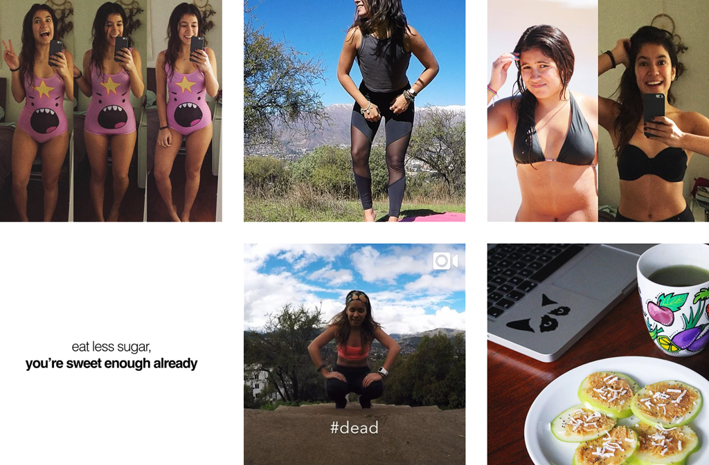
Squat Mango is Nati's (@Squatmango on Instagram) brand, through which she advocates for healthier living through exercise, better eating, and general well-being. Above is an image of her Instagram, where you can see the main kind of content she creates on it. Though the brand currently includes her blog, Instagram, and publications, she plans to expand into new directions in the future. To create brandmarks for her brand, it was important to tie back the Squat Mango name (which is ambiguous) to her content - in a way that tells a story - to create a coherent brand which will be flexible enough for future endeavours.

For a visual mark, we directly unify the 'mango' and 'squat' concepts to create a coherent brand by depicting two conjoined mangos that also look like a woman's behind as she is doing a squat. Though some people might consider this composition irreverent, for our target audience of young women, it is a great attribute to 'push the envelope' a little bit. If the brand evolves in a way that requires a serious demeanour, the visual mark can evolve to only depicting 1 mango.
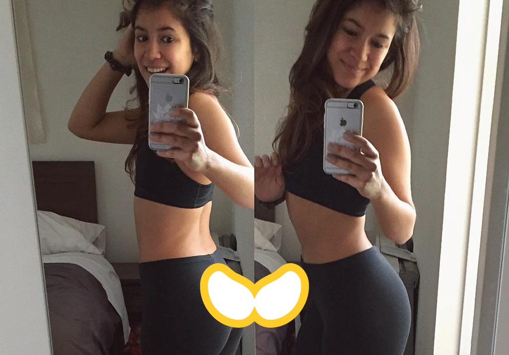
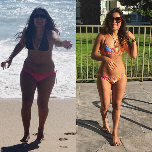
This composition also tells a story - as frequently seen in her Instagram, and many others devoted to fitness, before and afters are a huge part of their content and stories. 'Split' photos, like the one seen below, are very frequent, and add more coherency to the story of the brand through its visual mark.
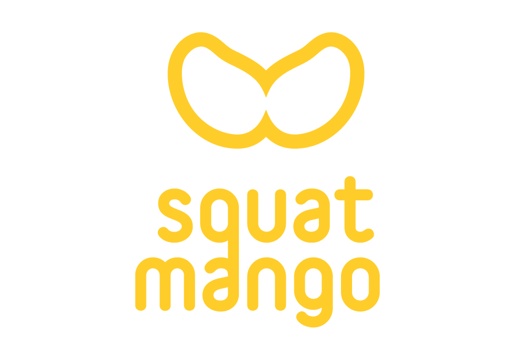
For a wordmark, a composition is created that emphasizes the symmetrical characteristic of the visual mark with a perfectly symmetrical (horizontally, but between them vertically as well) u and n. The regular lines and relative size of the mark helps to create coherency with the borders and composition of the visual mark. Communicationally, the wordmark extends the 'feeling' of the brand - happy, lighthearted, and dynamic.